
零基础网页开发21(配套CSS代码)
我将整个CSS样式表放在一个代码块中,并在每部分添加注释进行解释。
注意:CSS中的选择器用于指定要样式化的HTML元素。样式规则由属性和值组成。
以下是逐段解释:(可直接复制,配合HTML代码使用)
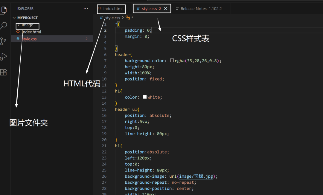
/* 以下是完整的CSS样式表解析 *//* 全局重置:清除所有元素的内外边距 */*{ padding: 0; margin: 0;}/* 页眉样式 */header{ background-color: rgba(35,28,26,0.8); /* 深色半透明背景 */ height:80px; /* 固定高度 */ width:100%; /* 全宽 */ position: fixed; /* 固定定位(始终在顶部) */}/* 标题基础样式 */h1{ color: white; /* 白色文字 */}/* 导航菜单定位 */header ul{ position: absolute; /* 绝对定位 */ right:5vw; /* 距离右边5%视口宽度 */ top:0; /* 顶部对齐 */ line-height: 80px; /* 垂直居中 */}/* 网站标题特殊效果 */h1{ position:absolute; /* 绝对定位 */ left:120px; /* 左侧偏移 */ top:0; /* 顶部对齐 */ line-height: 80px; /* 垂直居中 */ background-image: url(image/司绿.jpg); /* 用图片作为背景 */ background-repeat: no-repeat; /* 禁止平铺 */ background-position: center; /* 居中显示 */ width: 210px; /* 固定宽度 */ text-indent: -9999px; /* 隐藏文字(仅显示背景图) */}/* 导航菜单项样式 */header li{ display: inline; /* 水平排列 */ margin-right: 4vw; /* 右侧间距 */}header a{ color:white; /* 白色链接 */ text-decoration:none; /* 无下划线 */}header a:hover{ text-decoration: underline; /* 鼠标悬停显示下划线 */}/* 最新动态区域样式 */.news{ background-color: antiquewhite; /* 备用背景色 */ color: white; /* 白色文字 */ height: 95vh; /* 高度占95%视口 */ background-image: url(image/思蓝.jpg); /* 背景图片 */ background-repeat: no-repeat; /* 禁止平铺 */ background-size: cover; /* 覆盖整个区域 */ background-position: center; /* 居中显示 */ display: flex; /* 弹性布局 */ flex-direction: column; /* 垂直排列 */ align-items: center; /* 水平居中 */ justify-content: center; /* 垂直居中 */}.news h2{ font-size: 60px; /* 大标题 */ margin-top:60px; /* 顶部间距 */}.news p{ color: #fef7e6; /* 浅米色文字 */ font-size: 18px; margin:25px 0; /* 上下间距 */}.news a{ color:white; text-decoration: none; border: 1px solid #acacac; /* 边框 */ padding: 10px 20px; /* 内边距 */ border-radius: 5px; /* 圆角 */}/* 标语区域样式 */.slogan{ background-color: #485652; /* 深绿色背景 */ color: white; height: 250px; /* 固定高度 */ display:flex; justify-content: center; /* 水平居中 */ align-items: center; /* 垂直居中 */ font-size: 20px; line-height: 1.8em; /* 行高 */}/* 页脚样式 */footer{ background-color: #000000; color: #b7b7b7; /* 浅灰色文字 */ height: 60px; /* 固定高度 */ display:flex; justify-content: center; align-items: center; font-size: 14px; }/* 商店区域布局 */.shop{ display: flex; /* 弹性盒子布局 */}.shop img{ width: 50%; /* 图片占一半宽度 */}/* 商店信息区域 */.info{ width: 50%; /* 占一半宽度 */ background-color: white; display: flex; flex-direction: column; /* 垂直排列 */ align-items: center; justify-content: center; }.info h2{ font-size: 40px; margin-bottom: 30px; /* 底部间距 */}.info p{ text-align: center; /* 居中文本 */ line-height: 2em; /* 2倍行高 */}/* 产品展示区 */.product{ display: flex; background-color: #ede9db; /* 米色背景 */ justify-content: space-between; /* 等间距分布 */ align-items: center; padding: 100px 180px 80px; /* 内边距:上 左右 下 */}.product div{ width: 300px; /* 固定宽度 */ text-align: center; /* 居中内容 */}.product img{ width:100%; /* 图片撑满容器 */ border-radius: 10px; /* 圆角图片 */}.product h3{ font-size: 20px; margin: 20px 0; /* 上下间距 */}.product p{ font-size: 14px; line-height: 1.6em; /* 1.6倍行高 */}/* 电子报订阅区 */.newsletter{ background-color: #485652; /* 深绿色背景 */ color: white; padding: 60px 0; /* 上下内边距 */ display: flex; flex-direction: column; align-items: center; }.newsletter p{ margin-bottom: 20px; }/* 表单元素样式 */.newsletter input,.newsletter button{ background-color: transparent; /* 透明背景 */ color: white; border: 1px solid #949d9a; /* 边框 */ padding: 10px; border-radius: 5px; /* 圆角 */}.newsletter input{ width: 200px; /* 固定宽度 */ margin-right: 15px; /* 右侧间距 */}.newsletter button{ width: 80px; cursor: pointer; /* 手型光标 */}/* 输入框特殊状态 */input::placeholder{ color: #dddddd; /* 占位符颜色 */}input:focus{ outline: none; /* 移除默认轮廓 */ border-color: #e0e9a3; /* 聚焦时边框颜色 */}/* 移动端菜单默认隐藏 */.menu{ display: none; }/* 响应式设计:屏幕宽度≤768px时触发的样式 */@media screen and (max-width: 768px) { /* 隐藏桌面导航 */ header ul{ display: none; } /* 居中标题 */ header h1 { left:50%; transform:translateX(-50%); /* 水平居中 */ } /* 调整新闻标题大小 */ .news h2{ font-size: 40px; } /* 显示移动菜单按钮 */ .menu{ display: block; background-color: transparent; color: white; font-size: 35px; position: absolute; top:15px; left:20px; border:none; cursor:pointer; /* 手型光标 */ } /* 调整商店区域为垂直布局 */ .shop{ flex-direction: column; } .shop img{ width: 100%; /* 图片全宽 */ } /* 调整信息区域 */ .info{ width: 100%; padding: 40px 0; /* 增加上下内边距 */ } .info h2{ font-size: 30px; /* 缩小标题 */ } /* 产品区域改为垂直排列 */ .product{ flex-direction: column; padding: 60px 0; /* 调整内边距 */ } .product div{ margin-bottom: 30px; /* 产品项间距 */ }}
样式表整体解析:
1. 设计特点:
◦ 全屏背景:.news区域使用全屏背景图
◦ 固定导航:position: fixed实现滚动时导航栏始终置顶
◦ 隐藏式文字:text-indent: -9999px隐藏h1文字(仅显示背景图)
◦ 响应式设计:@media查询实现移动端适配
2. 布局系统:
◦ 使用 Flexbox 布局(.shop, .product, .newsletter)
◦ 使用 视口单位(vh, vw)实现响应式尺寸
◦ 绝对定位用于导航菜单(position: absolute)
3. 交互效果:
◦ 链接悬停效果(text-decoration: underline)
◦ 输入框聚焦效果(border-color: #e0e9a3)
◦ 按钮悬停指示(cursor: pointer)
4. 移动端优化:
◦ 768px以下隐藏桌面导航
◦ 显示汉堡菜单按钮(☰)
◦ 垂直排列产品项
◦ 全宽图片展示
5. 视觉细节:
◦ 半透明导航栏(rgba(35,28,26,0.8))
◦ 圆角设计(border-radius: 10px)
◦ 间距系统(使用margin和padding控制元素间距)
这个样式表与HTML配合,创建了一个具有文化氛围的响应式网站。
桌面端显示专业布局,移动端自动调整为更适合小屏幕的垂直布局。
本文由于给出了整个CSS样式表,所以此篇文章的篇幅较长,但是非常实用,结合上篇给出的HTML代码,直接复制就能上手用。千万不要被文章的篇幅所吓倒~
阅读原文:https://mp.weixin.qq.com/s/TKKHbInbtcoisivAO4tOww